


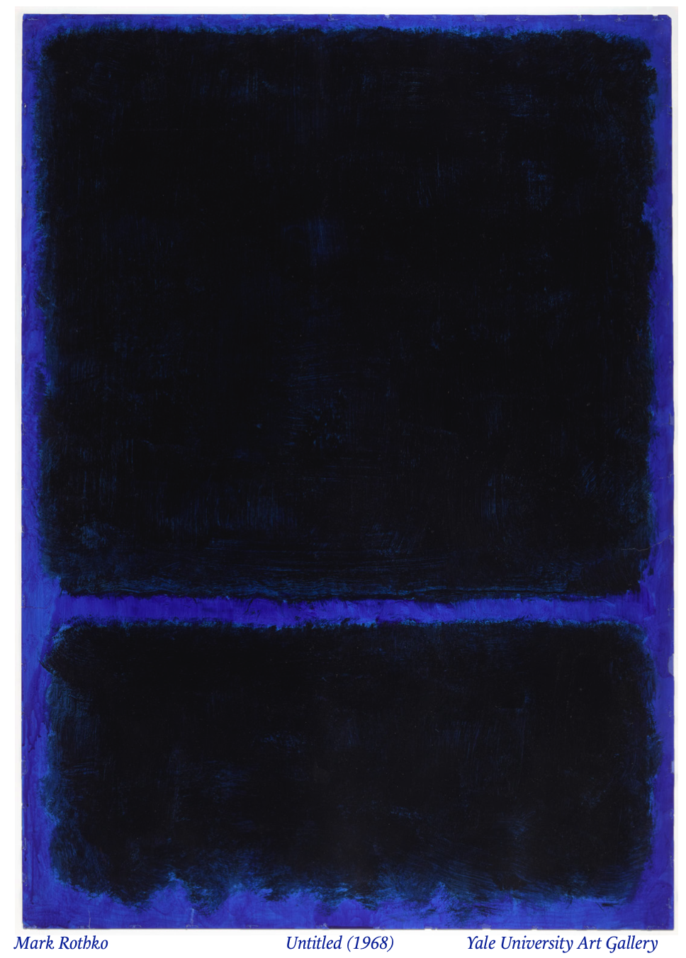
Take a look at Mark Rothko’s Untitled (1968) – the blue background displays a deep sapphire shade that, although obstructed by large black blocks, nonetheless hypnotizes and radiates an overwhelming, solitary gravity. The colors wash over and swallow the viewer. The work draws the gaze in, appearing as a diveable well into the infinite and unknown. One feels empty, subsumed by the void before them.
At least I feel that way, but maybe the blue doesn’t do it for you. Maybe you think Rothko’s color fields are just a bunch of paint blobs. Or maybe he’s just one of the many great abstract expressionists. Many, if not most, view Rothko in these latter ways, not leaning towards a more emotional interpretation. It makes me question if I invented my interpretation from nothing, and if my experience is legitimate. Since Rothko’s color-fields reduce two-dimensional art to its most fundamental elements – shapes, textures, and, crucially, colors – his works are the perfect basis to explore the effect of color in its most primal form, as simply the shade, the pigment. Can color, specifically blue, because I find its depth uniquely powerful, limn the ecstasies and tragedies of life and elicit real, justifiable emotions? Or am I playing a trick on myself, divining something out of nothing? Am I just unbearably pretentious?
“Blue” is what we say to refer to 450 to 495 nanometer wavelength light, sandwiched between “green” and “indigo”. It appears occasionally in nature: in certain minerals, hydrangeas, and the iridescent rings on a blue-ringed octopus, but it’s rare. For things in nature to appear blue, an organism’s cells must absorb longer-wavelength, lower-energy light, which demands more energy from the organism; only niche evolutionary paths can produce an organic blue.
Early humans didn’t employ blue at all, with primeval cave paintings only marked by charcoal blacks, and clay reds and yellows mixed with fat and fire. Ancient Egypt made the first-known blue, “Egyptian blue,” from mixing copper, sand, and calcium in a furnace. Out of that crucible came a glassy material of copper silicate, which, when ground up, gave the new power of a previously-unattainable pigment to the surfaces of the world. Blue became part of the human palette.
Egyptian blue, however, would be lost between the exchanging hands of history, as the Romans didn’t know how to make it. They used alternative methods: ancient sources detail a week-long process of mixing efflorescent copper-mash, violet petals, fat-based soap, and urine to obtain “azure-blue,” which can be purified by adding lime, other flowers, or sealing it in a process similar to wine fermentation. New shades of blue popped up in the human lexicon.
Until the 19th Century, these intensive copper-based methods persisted. Blue pigment would cost artists and patrons greatly, while people throughout the ages sought finer and more efficient methods. Semi-precious minerals, azurite and lapis lazuli, were the other primary sources of blue pigment, demanding significant labor and cost to extract and make usable. Azurite was relatively common and contained dark and light-blue specks, with a greenish hue. Lapis lazuli, on the other hand, bore a deep, weighty blue that waxed purplish. More expensive than gold, lapis lazuli, also called “ultramarine blue” (a deeper blue than the sea), was highly valued for its luster and pure deep-blueness. Ultramarine was found in the Ajanta Caves in India, decorating the colossal Buddhist monuments. In Renaissance Italy, it was almost exclusively reserved for depictions of the Virgin Mary and Jesus. This blue, the deepest blue, was only used in religious and regal imagery due to its rarity and cost. It’s rumored that Michaelangelo left The Entombment unfinished because he couldn’t procure the funds for ultramarine pigment. Blue maintained a lofty, opulent quality that projected an august gravity.
The 19th and 20th Centuries brought new techniques for pigment synthesis, which brought down the cost of color, especially blue. Synthetic ultramarine and a new “Monastral Blue,” another deep shade, began to be industrially produced. Blue of all kinds was no longer only for kings and Christ. Blue can be found from Monet’s plein-air impressionism to Rothko’s color fields. No longer exorbitant and widely unusable, it could become and mean anything.
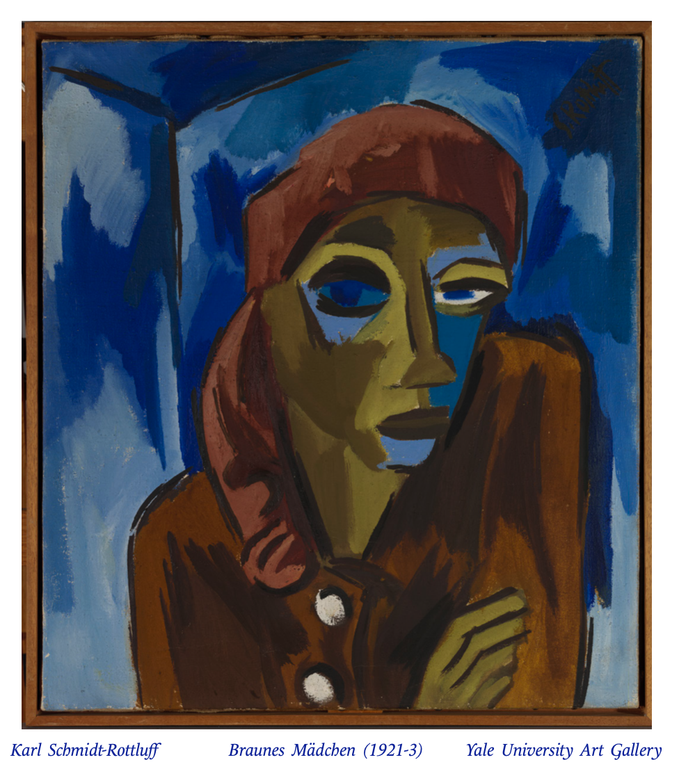
The Yale University Art Gallery offers blue in many flavors and fragrances, particularly with their modern works. We have Braunes Mädchen (Brown Girl) (1921-3) by Karl Schmidt-Rottluff, an oil painting of a glancing girl wearing a brown headscarf, almost shrugging (is she diffident or indifferent?). Brushes of blue occupy the tilted walls in the background, and the shades of blue reach over to her cheeks and eyes.
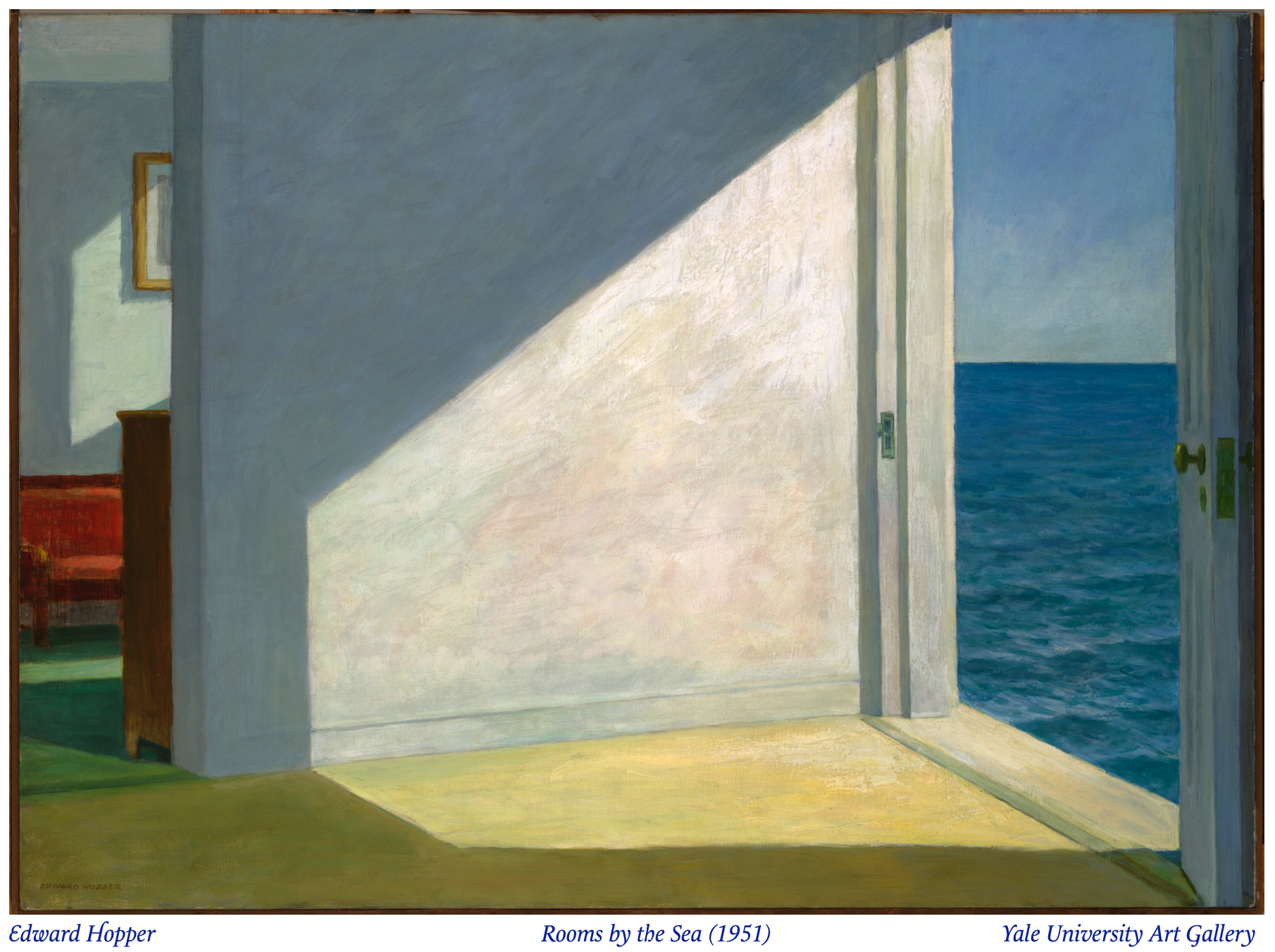
Rooms by the Sea (1951) by Edward Hopper shows the interior of a lonely sea-side room: the threshold at the left hints at a living room with velvet couches and an obscured photo, and the right opens up to the sea, as if the room were in the middle of it. The sapphire water contrasts with the muted blue of the sprawling shadows. When I saw it, the solitude desolated me, as if I could be swallowed by the sea, menacingly edging into view.
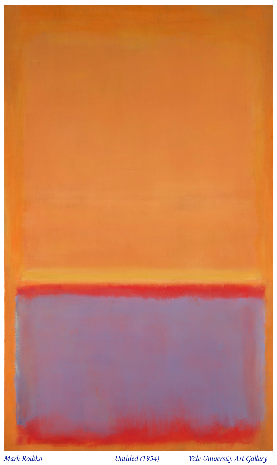
Untitled (1954) by Rothko – not to be mistaken for the 1968 one – is brighter, mostly orange and red, but a faded field of sky-blue sits on the bottom third. It’s a monolith, ninety-three by fifty-six and three-sixteenths inches, and the lightness of the blue held me for a while: the shade was in its dissipating moment, and if I looked away for even a second, it would be gone.
Modern blue can be the shadows on an oceanside inn, the walls and air surrounding that encapsulate us, and even a formless field, marking a revolution in color. Were modern artists conscious of this revolution? The historical record offers nothing specifically, but modernist movements obsessed over the use of vivid colors. Picasso had a “Blue Period,” then a “Rose Period,” largely referring to his palettes during the respective eras. Matisse had his Blue Nudes, made shortly before his death, lithographic cutouts of abstract women in classical poses, colored ultramarine against white backgrounds.
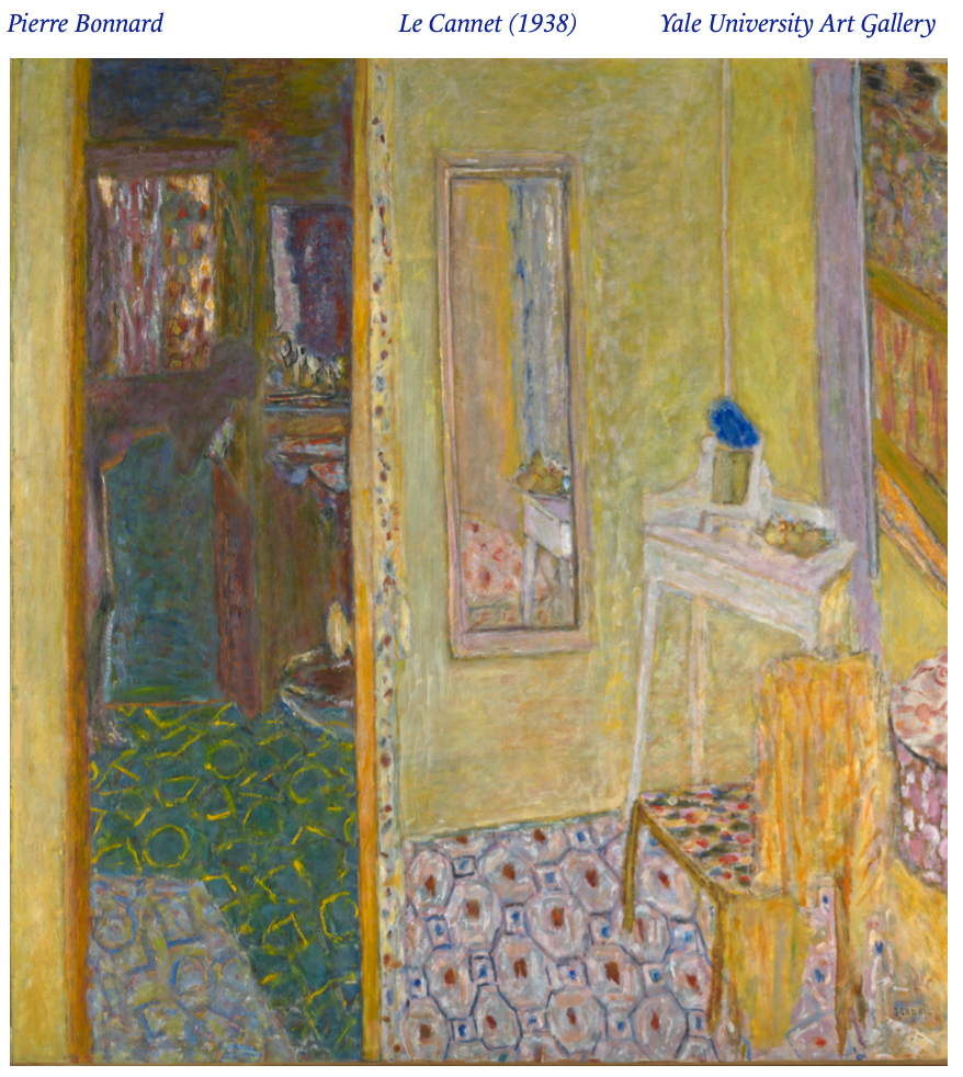
Interior at Le Cannet (1938) by Pierre Bonnard could offer a commentary: vivid lapis flowers sit at the compositional center, as if the blue constitutes a distinguished rarity, but it subtly lies elsewhere throughout the painting: in the floor patterns, on the walls, in one splotch in the top-left corner. Maybe Bonnard was being satirical: this once-revered pigment is now everywhere, profaned. Did modernity profane blue? Once rare and elevated, it now signifies nothing concrete or specific, almost at risk of entirely losing meaning – are we just to derive sadness or solitude from looking at the pure blue of a Rothko? Perhaps blue possesses its own meaning, somewhere between 450 to 495 nanometers, or maybe we killed it.
“Depth, trust, loyalty, sincerity, wisdom, confidence, stability, faith, and intelligence” is what comes up on the first website (supercolor.com) when you Google, “what does blue mean.” “The color blue represents both the sky and the sea and is associated with open spaces, freedom, intuition, imagination, inspiration, and sensitivity,” continues supercolor.com. But, doesn’t the sea also represent danger and peril as in, for example, the Odyssey? Blue can mean cold, since it’s the color of ice, but fire, when extremely hot, becomes blue. So can’t blue also mean hot? Essentially, the invented symbolisms of blue are barely inherent to its hue.
The site claims that blue “calm[s] and release[s] feelings of tranquility,” which enters the world of chromotherapy, a practice which posits that colors inherently have therapeutic and even medical applications. Chromotherapist Samina Yousef Azeemi offers that simply seeing colors can treat “cancers, SAD, anorexia, bulimia nervosa, insomnia, jetlag, shift working, alcohol and drug dependency.” It should be well noted that scientists believe that chromotherapy is pseudoscience, with any emotional effects from color likely placebos, though color does elicit basic reactions for most people. If the inherent symbolism of blue is undefined, then certainly its visceral effects (which I felt with the first Rothko) are even more doubtful.
It’s easy to feel the awe of God in the Sistine Chapel or intense agony in an El Greco painting, as faces and scenes we see as our own are present, but, in a modernist world, when elements of art become abstracted, when forms and components no longer have the firm anchors of traditional realism, color itself may not fill the vacuum of meaning that traditional and realist art left. I worry that we lost emotion in pre-modern art, and that we cope with modern art, especially the more abstract, through inventing loftier, more erudite (and even more elitist), and less relatable concepts with which we nonetheless attempt to relate. I sometimes think that I feel about the 1968 untitled Rothko the way that I do because Rothko is “important,” and I should be feeling something more than what’s on the canvas. Perhaps the ultramarine blue captivates me only because I wish to be captivated.
But I won’t ruin Rothko for myself. Maybe blue doesn’t have any inherent meaning, and it has to rely on human-made cultural contexts: it must be rare to feel special, and it must only be used with Christ or Mary to feel divine. But, what if “meaning” and “interpretation” are besides the point? What if we allow ourselves, in spite of the instinct to glean validating “meaning,” to simply feel the work and embrace whatever comes up? I say go to the YUAG’s Modern and Contemporary Art section and pick out a work that’s interesting (it doesn’t have to be blue). Don’t read the blurb next to its description, and just look at it for as long as it keeps you. Let the experience be for you. Indulge in it.
I mean, consider the Ancient Egyptians. They didn’t need to invent Egyptian blue – there was potentially no precedence for the synthesis of blue pigment. But, the shimmering blue of the Nile and the deep sheen on the shells of scarabs must have called forth something deeper within them, the recognition of something that so perfectly limned aspects of their being not yet depicted or even depictable. They had to make it for themselves.