


At 1046 Chapel Street, tucked between Panera and Starbucks, there is a city deconstructed.
“Beauty Through the Back Door,” currently on view at the Fred Giampietro Gallery, celebrates urban space stripped down to its basic core, familiar sights distilled to their fundamental essence. Featuring the works of the late conceptual artist Gerald Ferguson and Yale alum Jonathan Waters MFA ’77, it’s a thoughtful meditation on what exactly constitutes the world we see today: the materials, the colors, and the people who bring it all together.
Of the pair, Ferguson presents perhaps the starker vision. Using mostly only black paint on white canvas, he portrays commonly overlooked aspects of city life: ashcans on street corners, drain covers by curbs, doormats under feet. The city — or, at least, what Ferguson chooses to represent in it — is a plain subject. However, Ferguson’s careful omission of everything but the crudest details both disturbs and fascinates.
In “16 Ashcans,” Ferguson depicts only the lids of trash bins, reminiscent of miniature headstones. And in “2 Drain Covers,” he paints metal gridding, thick black punctuated by evenly spaced, miniscule squares. Ferguson’s meticulous style elevates the otherwise visceral nature of his craft: his paintings are rough, coarse, heavy-handed, but undeniably controlled. Ferguson makes urban construction visible. It’s not hard to imagine these structures — these ordinary, but somehow magnetic structures — originating in the sketches of some architect.
In Ferguson’s strongest works, he pares his subject matter down to only what’s necessary for the barest sliver of recognition. For instance, his works “24 Drain Covers” and “3 Doormats” reject ornamentation. “24 Drain Covers” is all straight lines and sharp angles, while “3 Doormats” features strokes of black paint, rough and tousled.
His weaker works are the ones that break away from the carefully crafted industry of the others, the ones that are slightly more whimsical and literally more round. “4 Ashcans” depicts the tops of trash cans, circles within circles within circles, while the aptly named “4 Circles, 4 Ellipses” features — no big surprise — circles and ellipses. While these pieces are certainly more fun and light than the rest of Ferguson’s work, the lack of edge — and edges — detracts from the realness and grit that permeates Ferguson’s collection.
A special exception, however, is “No. 14,” Ferguson’s only piece in the exhibition that features color. Splats of red, blue, yellow, and green stand out among black drips, all on a white background. There’s something like graffiti to it — something spontaneous and refreshing beyond the conciseness and tightness of Ferguson’s other works.
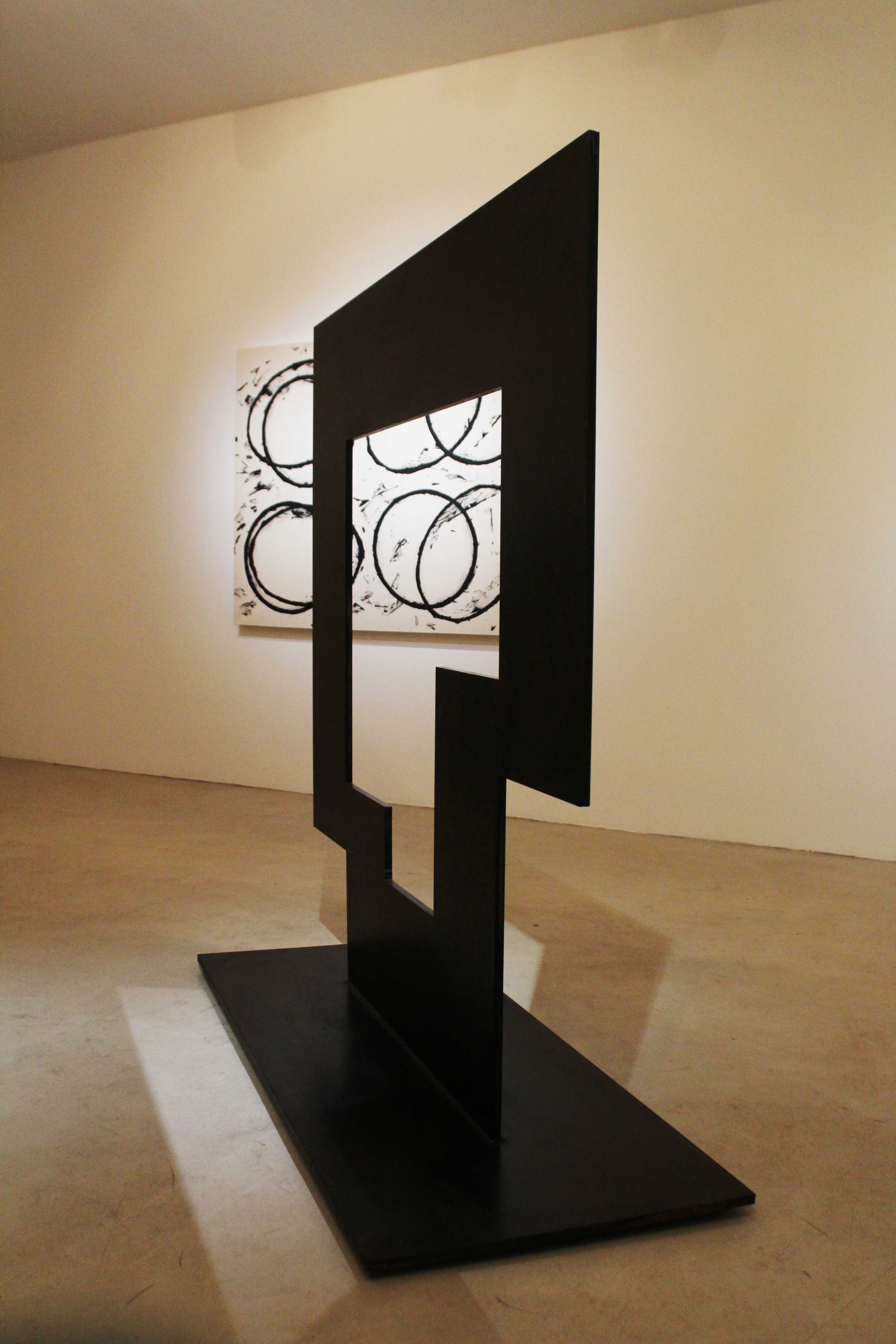
Jonathan Waters, on the other hand, experiments with sculptures and cutouts rather than canvas and paint. For the most part, he works with blocks: blocks of wood carved in seemingly impossible-to-balance shapes; blocks of thick paper patched together, almost like Tetris. While Ferguson may be more literal in his depiction of the city, Waters plays around with the idea of space, of doors, windows, inside and outside. There’s something very basic to his approach — in the end, it’s just squares and rectangles put together — but that simplicity lends his collection an air of childhood and imagination.
His sculptures most strongly demonstrate this particular whimsy. Evoking building blocks, they’re curious that manage to remain standing despite their precarious shapes. In particular, “Coleraine” and “Resting Red” highlight the sense of putting things together, of using the most basic to create the most complicated. In stark contrast, Waters’ “Positive/negative #1” and “Positive/negative #2” are two giant metal structures more industrial and complex than the smaller sculptures that dot the rest of the gallery. There’s a sense of growing up in those two pieces, of maturation and loss, which makes Waters’ other work all the more compelling.
Waters’ framed art also captures his smaller sculptures’ essential creativity. Comprised from patched paper of different colors — rich black, smooth red, cream white — the pieces have something rough about them. It’s in the slightly uneven edges of the shapes, the pencil traces on the paper, the wrinkles around the edges where the glue may have not stuck properly. “Flushing Road” is perhaps the best demonstration of this controlled “mess”: a large signature — maybe the artist’s, maybe not — is cut off in the middle, almost as if by accident.
Nevertheless, Waters’ style is far from distracting or sloppy. If Ferguson’s works feel like a professional architect’s sketches, Waters’ sculptures evoke that architect as a child, for whom playful curiosity trumps nonnegotiable perfection. It’s no wonder that Waters picked names such as “Colonsay,” “Priddys Hard,” and “Great Nore” for his pieces. There’s something extraordinarily compelling about childhood and the thought that all the grand cities we see today had to come from somewhere.