


The letters of the alphabet swim before my eyes like dark tadpoles. From left to right, the letters grow in weight, gaining mass and announcing their presence more dominantly to the world. I am not watching an optical illusion; instead, I’m looking at a large, long white poster neatly printed with the 26 letters of the alphabet, in four different thicknesses. This new font, designed by Ana Barros ’18, is called “Corpus.”
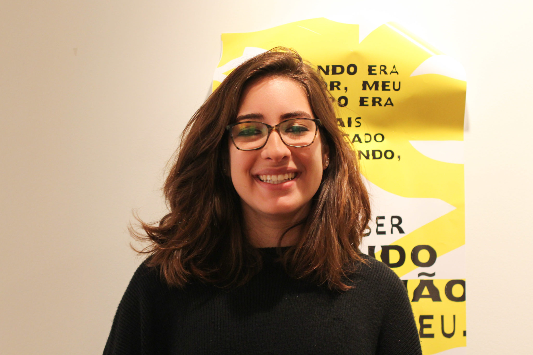
Ana is a political science major with a concentration in political philosophy. She’s a self-professed “secret art major,” having virtually taken every graphic design course offered to Yale undergraduates.
Last Tuesday, I joined Ana for breakfast to discuss her new exhibition “Corpus” and the experiences of her and the women in her family facing sexualization and objectification in Brazil. The font was developed after a rigorous and intensely personal research process that began when Ana discovered that Brazil, where she was born and spent the early years of her life, was named the “sexiest country” according to the 2017 U.S. News Best Countries rankings. This spurred her to develop a font that explored the lived experiences of women from Brazil and their struggle with body image issues.
Q: You chose to focus your exhibition on Brazil and on Brazilian women in particular. Is that because Brazil is the country you feel most kinship toward?
A: That is where my body is from. Especially since I’ve moved to the United States — I moved here when I was 14, 15 — going through puberty, thinking about myself in the context of other bodies, and doing that in a place like Cincinnati that is like, 95 percent white … Obviously I can’t make generalizations about bodies in general, but the American body shape is very different from mine. And I didn’t realize a lot of the shame I was feeling when I was comparing myself to other girls my age just came from the fact that we come from very different places. I have certain aspects of my body that are not generally seen in prepubescent American girls. That was really hard for me at that age.
But the reason that this project also was focused on Brazil is because [of] something that my art professor last semester gave to us as a prompt. So the U.S. News & World Report comes out with this thing called a Best Countries Ranking … So Brazil is number one for adventure. And one of the sub-attributes of adventure is this attribute “sexy.” So Brazil got a ten out of ten on “sexy;” it’s number one in the world in “sexy.” And I was like “What could that possibly mean?”
With Brazil, the word “sexy” carries very specific weight. Brazilian women are highly sexualized, not just within Brazil but also internationally. Everyone has this idea of the women in Carnival, very voluptuous women who are scantily dressed and dancing for the world to see. And it’s very toxic. Once you’re inside Brazil, there’s a lot of body image issues as well … It’s a toxic ecosystem that hits you from all sides.
And the prompt was “make a project about a reaction you had to this ranking.” This is my reaction: “This should not be a ranking. [This should not be] an attribute that they rank on.” So I started making a mood board, pulling images, and I was just depressed from all the pictures I was finding. If you just Google Image “Brazilian women,” it’s exactly what you expect to find. But I was hoping to not find that. So I was like, what if I just strip this project of images and make it entirely text based? Because the images are making me sad, and a lot of times we put more emphasis on the shape of these women’s bodies, but they have so much more to say, and so little avenue to say it.
Q: I understand that you drew a lot on your family experiences and conversations with the women in your family for this exhibition. The exhibition is an exhibition of their words, but other than that how do you think they influenced your creative process in general?
A: The women in my family are so strong … Everyone has this spark of saying, “No matter what the circumstances are, you can still do what you want to do.” … My mom grew up very not well-off but got herself into the best medical school in the country. My aunt also did not have the means to start her own school, but she did. … She’s now the principal of the school. I feel like I have been so encouraged by these women and all these ways that they probably don’t even know that I feel like I can [do anything]. I’m writing two theses now; I’m not an art major, and I’m very much not in the ideal circumstance to … be putting up an exhibit. But my mom always said, “Do art. That’s so important to you.” The stories of all the women in my family are of doing things “despite.”
Q: Could you tell me a bit about these conversations you’ve had with the women in your family that created the words you put on the posters in your exhibition?
A: The initial responses were, in some ways, guarded, as you would expect. I had the opportunity of talking to my mom over winter break, kind of calling her out on certain things that I felt she had not spoken about that I had experienced or seen her experience. And my cousin came to the US for the second time ever two weeks ago and came to visit me in New Haven for a day, just serendipitously … so we sat down at Shake Shack and talked for two hours.
The idea is to create more conversations, because we don’t talk a lot about this; it’s kind of a suffer-in-silence thing. The overwhelming sense I got growing up and that was confirmed by these interviews was, “The only thing that is going to get you anywhere in life is by being a good student”. My grandma was top of her class, had twelve siblings, and she [said], “The only thing that is going to get me out of this space I am in,” — she was bullied by her brothers for her weight — “is I have to be a good student.” What if there were other ways for us to deal with these questions that we have that are totally normal and organic but are kind of shamed?
Q: Do you think there’s a difference between how your grandma, and your mom and your aunt, and you and your cousin view their body depending on which generation they belong to?
A: My mom’s and aunt’s generation in the United States was a time for empowerment of women through political means. In Brazil that was not true. It was a very slowed-down process … So a lot of questions went unasked and unexplored in my mom’s generation. Then in my and my cousin’s generation, because of globalization and the internet, it feels like Brazil skipped a step. My cousins and I experience feminism in the same way that American people of our age do, although our mothers are a generation behind American mothers right now.
Q: Do you think it is because of the phenomenon of Brazil skipping a step-in feminism that you see so many violent and horrible outcomes, where there is a clash of modern feminism and a culture that isn’t ready for that yet?
A: I don’t want to make a broad claim, but there is absolutely a clash. I worked for a summer in Brazil in Recife. I realized how dangerous it was for me to have my American feminist values in a country that just, for the most part, is not ready for it yet. … But every single day I was waiting at the bus station I would get catcalled or yelled at, explicitly, or have people park their cars and start banging on the doors. And I was enraged: “I cannot believe this is happening.” But how can you not believe this is happening? Part of feminism means to be realistic about what the circumstances are around you, and that’s a danger of the exportation of American feminism.
Q: I was wondering if you could tell me a bit more about why you chose to use typography to represent these ideas about women’s bodies?
A: Typography is an incredible art form that no one thinks about. … For a long time, when the printing press was invented, each individual letter that was used to print books was carved out by hand, and it took so much time…This inheritance of this incredible art form that formed most of its existence handmade until 30 years ago gets kind of lost in this very digital generation. …
When I had the realization that I needed to do something that didn’t involve images, my first thought was, I need to design a typeface, then, that evokes the things that I intend to say. Because the font I wanted was not out there, it was in my head … instead of looking for a font that evoked what I wanted it to evoke, I just made it myself.
Q: How exactly did you create the font?
A: I took a letter, A for example, and I took an Exacto knife and cut it in a shape that evoked a body. And I took the piece that I cut off … and I glued it onto another letter A. And I did that twice. In typography, you have italics, bold, light, medium, et cetera, those are called weights, the weight of a font. Which I thought was a very beautiful … pun, because this is also about weight. So I have four weights [of each letter] … that’s the technical term. And I just did that for 26 letters. So I had these huge boards of four rows of these letters. I cut them out over Thanksgiving Break. Every single one of these are hand-cut by either me or my mom. …[Then] I photographed them individually, edited them, so currently the font exists just as image files. So I’m doing an independent study currently with that same professor…so I will be digitizing the files throughout the semester. It will be coded and you will be [able to type with this font].
Part of the concept behind this is, even when you cut things away, they’re never truly gone. …You never get to cut away parts of yourself entirely. You can lose weight, but there’s still emotional baggage to deal with. No matter how skinny you get or how fit you get, there’s still so much work to be done. And you are the totality of all of the things that you’re going through and that you are and that you look like and that you think.
“Corpus” is on display at Maya’s Room, which is the Silliman Art Gallery, until March 2.
Ko Lyn Cheang | kolyn.cheang@yale.edu